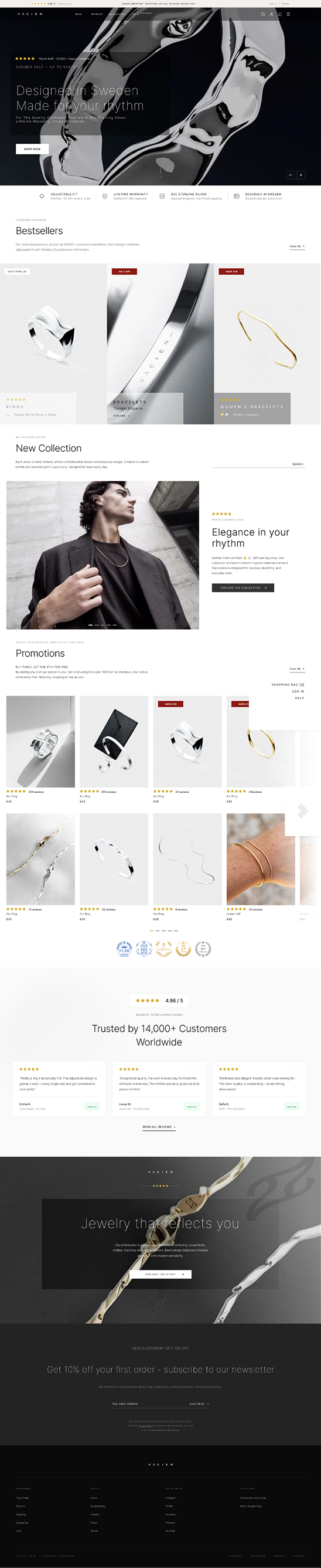
Vacier.com - CRO, Customer & User Behaviour Research
Sweden-based D2C minimalist jewelry brand with global eCommerce expansion, driven by Instagram acquisition, Nordic design language, and trust-based conversion.
17 Analysis Layers · 5 Critical Issues · Before/After Impact View · Prioritized Recommendations

Executive Summary
Methodology: Weighted average across 17 layers. Critical x3, High x2, Medium x1. Baseline 10 minus deductions.
Estimates based on D2C jewelry benchmarks. Removing the intermediate gender landing page alone could improve collection reach by ~12%.
Opening Notes
The highest priority issue, among several obvious problems, is the grid - not typography. While the typographic inconsistency is more visually noticeable, the grid is the critical CRO issue. BESTSELLERS is not even present on the homepage as a dedicated tile, even though it is consistently the highest-converting entry point in jewelry e-commerce. This represents direct lost revenue.
A less obvious issue is the 4.96 rating. 14,000 reviews is a strong form of social proof for this category - most premium competitors don't even reach a thousand. However, it is hidden in a line where it competes with a free shipping condition. This is a classic case of a brand unintentionally devaluing its strongest asset.
Announcement bar - trust signal saturation. The persistent top bar simultaneously presents four equally-weighted trust triggers: a 4.96-star rating, free shipping threshold, lifetime warranty, and Klarna BNPL. All four share the same typographic size and visual register with no established scanning order. Hick's Law states that decision-time grows with simultaneous stimuli. Fogg's Captology confirms that credibility cues work through isolation, not stacking. Eye-tracking studies (Nielsen - NN/G) show users stop parsing persistent announcement bars after repeated exposures.
Issues & Solutions - Before / After
Issue 01
Homepage collection grid - 8 equal tiles, no visual hierarchy
All 8 collection tiles are identical in size, typographic weight, and prominence. No dominant entry point. BESTSELLERS - the highest-converting entry - does not appear on the homepage at all. The brand presents as an inventory browser, not a curated editorial house.
Current state - 2×4 symmetric grid
MEN'S BRACELETS
WOMEN'S BRACELETS
MEN'S RINGS
WOMEN'S RINGS
MEN'S NECKLACES
WOMEN'S NECKLACES
Men's Sets
WOMEN'S SETS
Recommended - asymmetric editorial grid
BESTSELLERS
Hero tile · full width · 2× height · highest-converting entry
MEN'S BRACELETS
WOMEN'S BRACELETS
RINGS
NECKLACES
3-tier hierarchy: hero → primary categories → tertiary. Largest tile = highest-margin category (Fitts' Law). Asymmetric grids signal curation and raise perceived brand value. Visual hierarchy concentration increases click-through on dominant tiles (Baymard Institute, 2023 - eCommerce UX Benchmark; Nielsen Norman Group, 2020 - F-Pattern Scanning).
Issue 02
Navigation typography - 4 competing casing conventions
No single governing rule. SETS - Bundle Price (hybrid),
Log in (mixed case), and HELP CENTER & FAQs (lowercase 's') each break the
dominant uppercase system differently. Also: browser title uses "Minimal Versatile" while hero reads
"Timeless Versatile" - two brand taglines in one session.
Current state
MEN DROPDOWN
Recommended solution
MEN DROPDOWN
nav a { text-transform: uppercase; } eliminates all future drift at source.
Issue 03
NON-VIOLENCE in primary navigation - IA anomaly
NON-VIOLENCE sits as a top-level peer of MEN, WOMEN, and REVIEWS. Verified: it
routes to /pages/non-violence (editorial page), not /collections/ (shoppable).
A brand-values page occupying primary nav real estate wastes a conversion slot and creates orientation
confusion for new visitors.
Current - brand values mixed with commercial nav
A buyer looking for a ring does not expect a brand-values page at the same navigation level as product categories.
Recommended solution
Primary nav - commercial routes only
Footer - brand values section
/pages/non-violence = static
editorial content (no products). All shoppable sections use /collections/. Even MEN'S GIFT
GUIDE - which appears editorial - correctly uses /collections/mens-gift-guide and contains real
products. Recommendation confirmed.Issue 04
Rating 4.96 / 14 040 reviews - buried in the announcement bar
The site's most powerful trust asset competes for attention on equal footing with a shipping threshold. The rating never appears near a CTA, near a product card, or as a standalone hero element. 4.96/5 from 14,038 reviews places Vacier in the top 2% of jewelry stores globally - this asset is being systematically ignored.
Current - all signals equal, rating buried
Most valuable signal gets identical visual weight to a shipping condition. Below the fold - disappears entirely. Never reinforced at the add-to-cart moment.
Recommended - hierarchy by value
4.96 / 5
14 040 verified reviews · links to /reviews
Rating elevated into hero section as standalone element. Repeated on product cards and adjacent to add-to-cart button on PDP.
Issue 05
Hero CTAs "Men" / "Women" vs navigation MEN / WOMEN
The same destination is labelled differently within 200px of vertical scroll - mixed case in the hero, uppercase in the navigation. Fifth casing convention on a page that already has four. Violates Nielsen Heuristic #4 - Consistency and Standards.
Current - same destination, different label
Navigation
Hero buttons
Recommended - one label, one representation
Navigation
Hero buttons
One CSS rule. Eliminates the fifth casing convention from the page.
Layer 1 - First Impression (0–5 sec UX)
Premium quality
High-quality hero image establishes premium material quality
Trust bar
Well-positioned: 4.96/5, free shipping, lifetime warranty, Klarna
Brand clarity
Brand name legible, clean minimalist aesthetic
Navigation
Gender split (Men/Women) is immediately scannable
Core differentiator
Adjustability, lifetime warranty, Swedish origin - not positioned as above-the-fold value props
Price anchor
None established - users have no reference point for value
Primary CTA
Not clearly defined or visually prioritized
Competitive positioning
"Men"/"Women" lack visual weight. Why buy here vs Mejuri, MIANSAI?
Example direction (brand team decision)
"Designed in Sweden. Made for your rhythm"
Activates adjustable-fit differentiator + personal identity. Works across all touchpoints and languages.
Note: Final copy requires brand voice validation. The example above demonstrates the strategic direction - activating the adjustable-fit differentiator as a personal identity claim. 2–3 variations should be A/B tested.
4.96/5 from 14,038 reviews is a statistically exceptional signal - visible in the header as an aggregate number. But zero review text, no customer faces, no product photos from real buyers are visible anywhere on the homepage. The trust signal exists; the trust narrative does not.
Recommendation: Add a 3-review strip on the homepage - photo, name, product name, 1 sentence quote. This converts statistical trust into social/emotional trust.
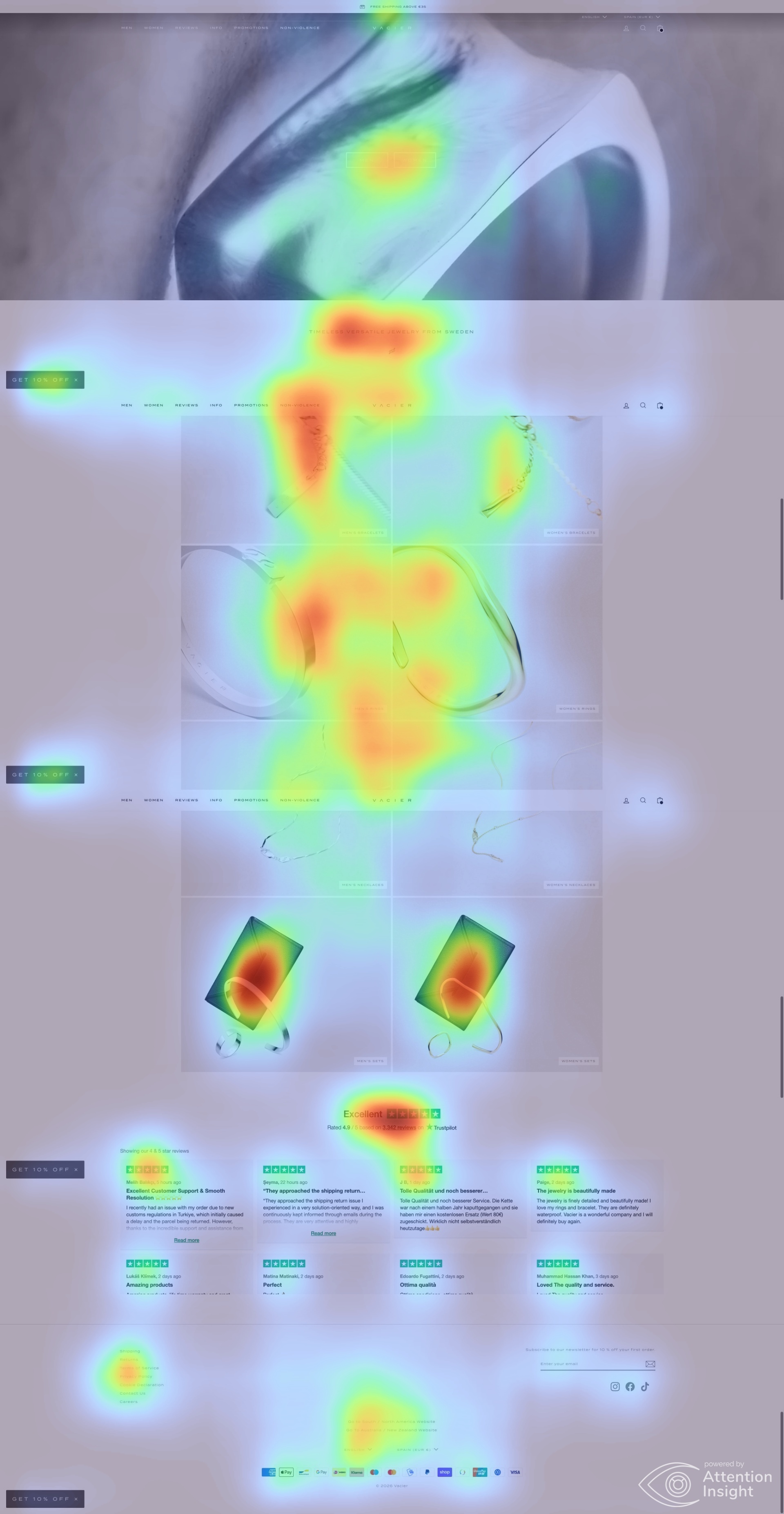
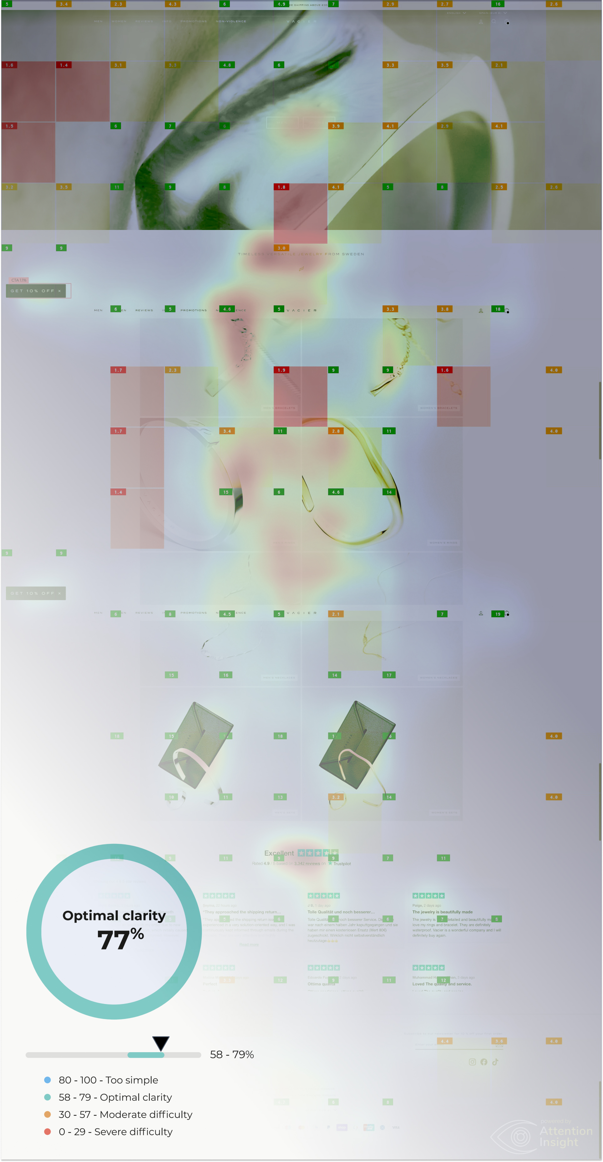
Layer 01b - Attention Insight Analysis (AI Eye-Tracking Simulation)
About this analysis
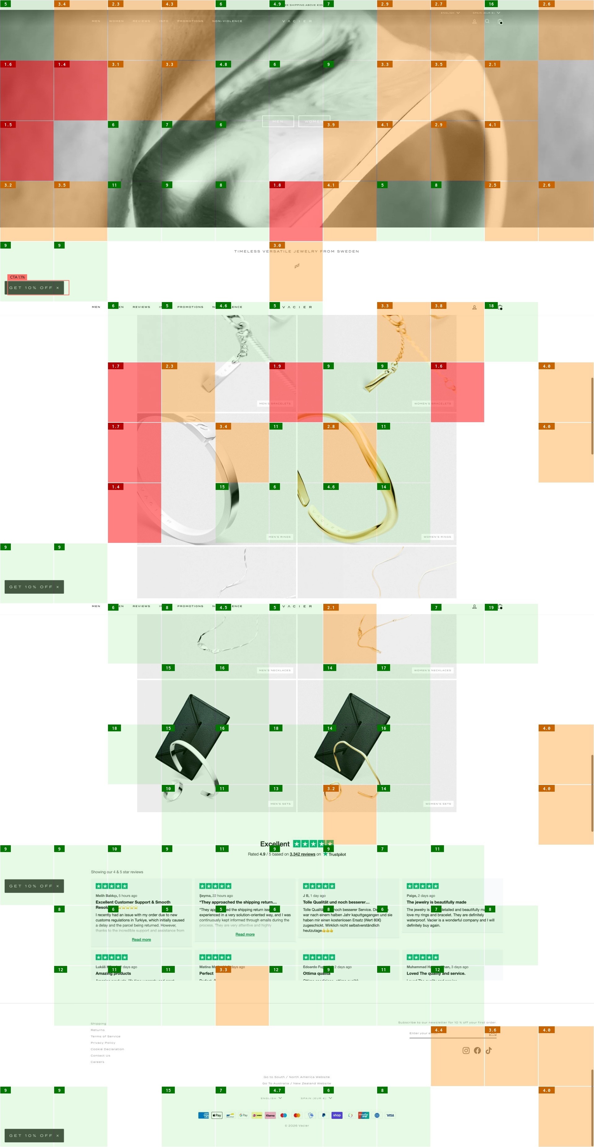
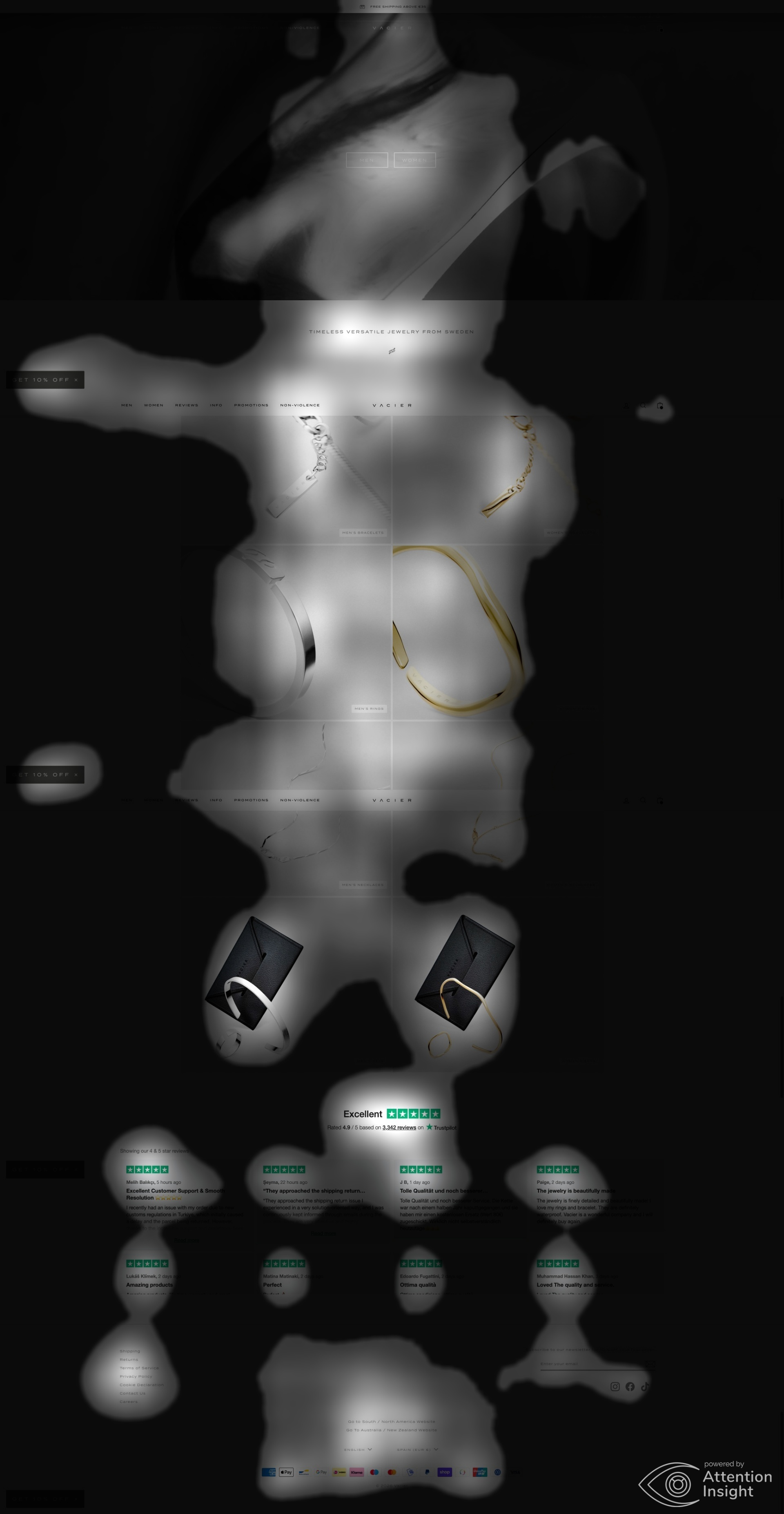
AI-powered eye-tracking simulation run on the Vacier homepage using Attention Insight. The analysis produced four independent maps - each measuring a distinct dimension of visual attention and accessibility. Results validate and quantify the UX findings identified in Layer 01.
77%
Clarity score
OPTIMAL
1.1%
CTA attention
2.4% avg
Synthesis - what the attention data tells us
CONFIRMED STRENGTH
Clarity 77% - the visual aesthetic is not broken. The brand photography performs. The problem is structural, not aesthetic.
STRUCTURAL PROBLEM
Attention is captured by photography, not transferred to action. The scan pattern has no behavioral destination after the hero.
QUANTIFIED FAILURE
CTA visibility at 1.1% - 54% below benchmark. Every conversion funnel metric is downstream of this single number.
Layer 2 - Heuristic Evaluation (All 10 NN/g Heuristics)
No visible cart count badge. No "Added to cart" confirmation state. After adding a product, no micro-confirmation (toast, animation, badge increment) is triggered. Uncertainty post-add-to-cart drives back-navigation and duplicate clicks. Estimated 5–8% ATC-to-checkout drop directly attributable to missing status confirmation.
Implement: (1) persistent cart item badge on icon, (2) slide-in toast "Added to cart - View cart" auto-dismissing after 3s, (3) cart icon animation on state change. All three are 1-day Shopify implementations.
Two label inconsistencies: (a) "SETS - Bundle Price" in nav vs "SETS - On Sale" on collection page for the same destination. (b) Browser tab: "Vacier - Minimal Versatile Jewelry" vs hero: "Timeless Versatile Jewelry from Sweden" - two different taglines in the same session.
Audit all nav labels across desktop/mobile/homepage/collection pages. Standardize to one label per destination. Align browser title tag with on-page hero copy - pick one tagline and enforce across all touchpoints.
No wishlist or save-for-later. No "continue shopping" in cart drawer. No undo/remove confirmation. For jewelry with a gifting use case, the absence of a wishlist removes a critical low-commitment engagement pathway. In jewelry, consideration cycles are 3–14 days for gifts.
Add wishlist (heart icon on product tiles, saved to account or localStorage). Add "Continue shopping" CTA in cart drawer. Enable quantity editing in cart drawer without navigating to cart page.
Four competing typography casing conventions exist simultaneously in the navigation: SETS - Bundle Price (hybrid), Log in (mixed case), HELP CENTER & FAQs (lowercase s), and hero CTAs Men/Women vs nav MEN/WOMEN. Nielsen's 4th heuristic states users should not have to wonder whether different words mean the same thing. One CSS rule nav a { text-transform: uppercase; } eliminates all drift at source. Additionally: browser title 'Minimal Versatile Jewelry' conflicts with hero headline 'Timeless Versatile Jewelry from Sweden' - two brand taglines in a single session violate brand-level consistency.
Standardize all navigation items to uppercase via CSS. Align browser title with hero headline. Audit all UI text for consistent casing conventions.
No sizing guidance surfaced before the PDP. For a brand whose core differentiator is adjustability, this is a structural UX error. The most common jewelry purchase anxiety is fit. If the answer is "our jewelry is adjustable - fits wrists 14–20cm," that answer must appear at the category tile level. Additionally: "lifetime warranty" with no definition is a half-trust signal. Industry data: 23% of jewelry ATC abandonment cites uncertainty about fit.
Add "Adjustable fit" sub-label on category tiles. Add wrist size guide on PDPs. Define "lifetime warranty" with 2 sentences inline - not just a link to a policy page.
Collection names (SETS - Bundle Price, 925 STERLING SILVER as a separate collection, INFO as a nav label) require users to recall meaning rather than recognize it. '925 STERLING SILVER' functions as a navigational destination rather than a material filter - meaning users must remember to look for it as a category, not discover it as a property. 'INFO' contains 5 semantically distinct destinations with no visual preview.
Add product attribute badges on collection tiles ('Adjustable fit', '925 Silver'), rename INFO to 'Help', surface sub-items on hover with 1-line descriptions.
No filtering or sorting on collection pages. A user wanting "silver bracelets under €50 sorted by bestselling" must manually scan all products. "925 STERLING SILVER" exists as a separate collection, not as a filter - material is navigational, not discoverable within a category. No quick-view on collection tiles.
Add filter sidebar: material (gold/silver/mixed), price range, type (adjustable/fixed). Add sort: bestselling, price low-high, newest. Add quick-view modal on tile hover/tap. All available via Shopify native filtering.
200+ countries in a footer dropdown contradicts "Minimal Versatile Jewelry" brand promise. On mobile it is a catastrophic infinite scroll. The V-logomark watermark over the hero creates visual noise without communicating brand value - it decorates rather than differentiates.
Replace country dropdown with auto-detected locale + "Change region" modal with grouped regions. Remove V-logomark from mobile hero; reduce to max 20% opacity on desktop and move to a non-competing zone.
Empty cart state shows: "THANK YOU FOR VISITING OUR STORE. LOOK AROUND AND SAVE WITH OUR PROMOTIONS." - a Shopify template default never replaced. The "Buy 2 / Free Wallet" upsell image in the empty cart targets zero-item sessions.
Replace empty-cart copy: "Your cart is empty. Start with our bestsellers →" + 3 product thumbnails with prices. Move Free Wallet offer to a progress bar that activates after item 1 is added, not before.
"INFO" as a primary navigation label is a black box containing 5 semantically distinct destinations: Help Center, Contact, Our Story, Shipping, Returns. 67% of online shoppers check returns policy before purchasing. If the policy takes 3 clicks to find, that confidence-building moment is lost.
Rename INFO to "Help." Add "Free returns" to trust bar as a visible clickable element. Expose "Shipping & returns" as a hover-visible sub-item with a 1-line summary in the dropdown.
Layer 3 - Information Architecture
Current (problems highlighted)
Proposed restructure
COGNITIVE LOAD ASSESSMENT
Layer 4 - User Flows (Critical Path Analysis)
/pages/men or
/pages/women - not a collection. The user clicks once and sees nothing new. Net result:
an unnecessary step that serves no product-discovery function.
Layer 4b - Checkout Flow Analysis
The checkout flow was not fully accessible during this audit session (Shopify-hosted checkout). The following findings are based on visible indicators and D2C jewelry industry benchmarks.
Layer 5 - Product Page (E-commerce Core)
Mobile verification recommended. Audit conducted via desktop session. If sticky ATC is already implemented on mobile, disregard this finding. If not confirmed - this is a high-priority fix.
Layer 6 - Visual Design & UI
Layer 7 - Graphic Design / Brand
Vacier has made the most common D2C minimalism mistake: confusing visual simplicity with informational sparsity. Minimalism in design is the elimination of unnecessary elements. But product names, prices, review counts, and value propositions are not unnecessary - they are the functional core of an e-commerce experience.
The brands that do this best (Skims, Aesop, Bottega Veneta) are minimal in decoration but dense in product communication. Vacier is currently minimal in both - and that is costing conversion.
The problem
The official Vacier 2025 logo is approved and in use on the main website. However, the old serif-style wordmark - a structurally different mark with a completely different visual language - remains active on Etsy and other commercial distribution channels. This is not a "primary vs secondary" logo system. These are two marks communicating two different brands.
What a customer experiences across the funnel
ETSY / PINTEREST

Serif mark
→
customer
clicks ad
VACIER.COM

Official mark
?
Brand
recognition
broken
BUSINESS IMPACT
- → Brand recall reduced across acquisition channels
- → Paid retargeting less effective - logo in ad ≠ logo on site
- → Etsy store undermines premium positioning of vacier.com
- → Trust gap at the moment of channel transition
- → Every marketing euro works harder with a unified mark
CHANNELS TO AUDIT & ENFORCE
ACTION REQUIRED
Replace the old serif mark with the official 2026 logo across all platforms listed above. This is not a design task - it is a brand governance task that costs nothing to execute and compounds the value of every brand investment already made.
Layer 8 - Typography
Limit ALL CAPS to: brand name, trust bar icons, primary nav labels of 6 chars or fewer. Use Title Case for longer labels (MEN'S GIFT GUIDE → Men's Gift Guide). ALL CAPS reduces reading speed by 13–20% for dyslexic users (British Dyslexia Association).
Layer 9 - Responsive Design (Mobile First)
Layer 10 - Conversion & Marketing Layer
Do now - high impact, low effort
Plan now - high impact, higher effort
Backlog - low impact, low effort
Deprioritize - low impact, high effort
Layer 11 - Trust & Credibility
| Signal | Present? | Location | Assessment |
|---|---|---|---|
| Star rating aggregate | Yes | Trust bar (header) | 4.96/5 from 14,038 - strong but only as a number, not a narrative |
| Lifetime warranty | Partial | Trust bar, footer | Stated but undefined - half-effective without explanation |
| Free shipping | Yes | Trust bar | Correct placement. Clear. Effective. |
| Klarna BNPL | Yes | Trust bar | Reduces purchase barrier. Text only - could be a logo for better recognition. |
| Free returns | Buried | INFO > Returns only | Major conversion barrier not addressed. 67% check returns before purchase. |
| Review excerpts/quotes | No | - | Critical gap. 14,038 reviews exist but no excerpts visible on homepage. |
| Customer photos (UGC) | No | - | Massive missed trust opportunity. |
| Trustpilot badge | Footer only | Footer | Below most users' scroll depth on mobile. |
| Material certification (925) | Partial | Nav item only | Exists as a collection, not as a product badge or quality signal. |
Layer 12 - UX Writing / Microcopy
Layers 13–14 - Performance & Accessibility
Performance
fetchpriority="high" and dominant color background placeholder. Preload hero via
<link rel="preload"> in theme head.
Accessibility
aria-label attributes
fail WCAG 2.1 SC 4.1.2. 30 minutes of Shopify Liquid edits: add aria-label="Search",
aria-label="Shopping cart, 2 items" (dynamic).
WCAG 2.1 COMPLIANCE SUMMARY
The site is technically sound, but fails at the point where conversion is actually formed.
Perceivable (A) and Robust (B) are solid. However, Understandable (C+) and attention control are weak.
The Core Problem
- The interface does not establish a clear decision hierarchy
- Key value signals compete with each other
- Users are forced to determine what matters on their own
Result: Cognitive overload reduces effectiveness of strong assets like social proof. The product under-monetizes attention - not due to a lack of trust, but due to how that trust is presented.
Layer 15 - Critical Issues Ranked by Business Impact
Critical #1
No products visible on homepage - 2+ clicks to reach any product
Every paid social click that lands on the homepage must navigate twice before seeing a single product. At an average €0.50–€2.00 CPC for jewelry audiences, this navigation tax converts CAC directly into wasted spend. An in-feed Instagram video showing a specific bracelet drives traffic to a homepage with no bracelet visible.
Implement a "Bestsellers" product row immediately below the hero: 4–6 products with names, prices, star ratings, and Quick Add. Expected impact: +8–15% homepage-to-cart conversion rate. Effort: 4–8 hours (Shopify section).
Critical #2
14,038 reviews architecturally absent from conversion path
4.96/5 places Vacier in the top 2% of jewelry stores globally. This asset is being used exclusively as a header stat. Review excerpts and customer photos drive 12-18% higher conversion than aggregate ratings alone (Bazaarvoice research).
Step 1 (1 day): Add 3 review quotes to homepage. Step 2 (3 days): Implement photo review display on PDPs (Judge.me, Loox, or Okendo). Step 3 (1 week): Build UGC Instagram feed strip on homepage. Total estimated conversion uplift: +10–20% on PDP-to-cart rate.
Critical #3
No value proposition - cannot answer "why Vacier over any competitor"
D2C jewelry is a saturated market. Without a clear stated differentiation, conversion relies entirely on brand aesthetics (present, strong), social proof (present, hidden), and price (unknown before clicking). A competitor site that states "adjustable fit · lifetime warranty · 925 silver" plainly on the homepage will convert cold traffic at a higher rate regardless of product quality.
Develop a 3-line VP statement: "Jewelry that fits every wrist, lasts a lifetime" · "Adjustable · 925 Sterling Silver · Designed in Sweden" · "Trusted by 14,000+ customers worldwide." Place between hero and category tiles. 2 hours copy + design.
Strategic Recommendation - Executive-Level Analysis

Strategic brief · Executive-Level Analysis · Prepared by Vsevolod Parypa
The core diagnosis
Vacier has built a product with exceptional social proof (4.96★ · 14k+ reviews), a defensible physical differentiator (adjustable fit), and a compelling quality narrative (925 silver · lifetime warranty · Swedish design). None of these assets are being deployed as conversion instruments.
The site currently functions as a branded catalog - it presents products but does not sell them. The gap between what Vacier has earned (product quality, customer trust) and what it converts (revenue per visitor) is the largest single commercial opportunity available to the brand.
Layer 16 - Quick Wins (High ROI, Prioritised)
Add 4–6 bestseller products to the homepage
Below hero, above category tiles. Product name + price + star rating + Quick Add button. Eliminates the 2-click barrier for high-intent homepage visitors. Highest-leverage change on the entire site.
Surface 3 review quotes + photos on the homepage
Manually curate 3 high-quality reviews with customer names, product purchased, and optional photo. Place between category tiles and footer. Do not wait for a full reviews widget - hard-code 3 reviews as a starting point.
Add trust strip below ATC button on every PDP
"Lifetime warranty · Free returns · Secure checkout" - 3 icons with micro-labels, directly below the Add to Cart button. Shopify Liquid template edit, repeatable across all PDPs.
Fix empty cart copy + add product recovery CTA
Replace "THANK YOU FOR VISITING OUR STORE..." with "Your cart is empty" + 3 bestseller product thumbnails. High-reach change - cart drawer is opened by a large percentage of non-purchasing sessions.
Add "Free returns" to trust bar + define lifetime warranty inline
Add "Free returns" as a 4th trust bar item. Add tooltip to "Lifetime warranty": "We replace any piece with manufacturing defects, forever." Both are copy changes with minimal dev effort addressing documented conversion blockers.
Deploy scroll-triggered newsletter popup with 10% offer
The 10% off first order offer is invisible in the footer. A scroll-triggered (50% page depth) or exit-intent popup captures email from users browsing but not converting. Expected improvement: 3–5× current email capture rate from the same traffic volume.
Move cart upsell to PDP progress bar
"Add 1 more item to unlock your free minimal wallet" - shown as a progress bar on PDPs after first item added, and persistent in the cart drawer. Moves the offer into the browse motivation layer. Expected AOV uplift: +15–25% for engaged users.
Layer 17 - Strategic Recommendations
Prioritised Fix Order
Grid → asymmetric editorial layout with BESTSELLERS as hero
Highest direct CRO impact. BESTSELLERS not on the homepage means the highest-converting entry point is invisible. One Shopify theme section edit. Asymmetric layout elevates perceived curation and supports premium pricing.
Elevate rating 4.96 into hero section and product cards
14,000 reviews at 4.96 is your strongest conversion asset and it is currently hidden. Place as standalone hero element, repeat on product cards, show adjacent to add-to-cart button on PDP.
Unified uppercase token for the entire navigation
Apply nav a { text-transform: uppercase; letter-spacing: .07em; } at
the theme level. Also manually fix SETS - BUNDLE PRICE and
HELP CENTER & FAQS in Shopify admin. Prevents any future manual edits from introducing
new inconsistencies.
Move NON-VIOLENCE to the footer
Frees a primary navigation slot. Places brand-values content alongside OUR STORY and CAREERS - where users who care about it will find it, without burdening the commercial navigation structure.
Hero CTAs → uppercase to match navigation
One CSS rule. Eliminates the fifth casing convention from the page and satisfies Nielsen Heuristic #4. Lowest effort fix in the audit.
Source Notes - NON-VIOLENCE Classification Verified
Factual verification · live URL fetch · April 2026
NON-VIOLENCE is an editorial page, not a product collection
The question was raised whether NON-VIOLENCE might be a shoppable product collection (which would justify its placement in primary nav). This was verified by fetching both URLs directly from the live site. The audit recommendation stands.
| URL | Shopify type | Contains products? | Verdict |
|---|---|---|---|
| /pages/non-violence | Static editorial page | No | Brand values content - move to footer |
| /collections/mens-gift-guide | Product collection | Yes | Correctly in nav (despite editorial name) |
| /collections/bestsellers | Product collection | Yes | Correctly in nav |
| /collections/sets | Product collection | Yes | Correctly in nav |
In Shopify: /collections/ = shoppable product
listing. /pages/ = static content with no add-to-cart functionality. Note:
MEN'S GIFT GUIDE, which appears editorial, correctly uses /collections/ - it
contains real products. NON-VIOLENCE uses /pages/. Recommendation confirmed.
Notes & Creative Ideas - Brand Voice Lab
Backstage - Design Research & Visual Development
Design Evolution
Time-lapse walkthrough of the research process and sketching